Friday, 18 November 2011
18/11/11 Update
I had been struggling up until this point as my work is soon due and my actors had kept dropping out and were busy when the other actor was free. I then was worrying a high amount but then just decided to choose more reliable actors but from doing so I had to redo the posters, and the trailer I had recorded before so this then puts me further behind. I am slightly worried that I will not reach my deadline but I am slowly dealing with this and have now got the images for my print product and will be doing the recording in my media lessons so that I am completed by the Wednesday deadline.
Editing logos into trailer
I was using Windows Live Movie Maker because I was at home for this stage of the editing process so it was a quite simple process and I have screen grabbed what I had done each time but it was a largely simple process so there weren't many screen shots needed.

This shows step one of the process and it is the same every time so I had only taken one screen shot of this. On the editor I used it had a 'add videos and photos' button so I had to just click this and it came up with the screen in which is shown on the screenshot. From this I had then selected the three logos in which I wanted to put in and the three shots below show the logos being added, one after the other.


These shots show the three logos in which I had made and put into the video I was making. This was quite simple and from this I didn't have to do anything except from changing the length of time all of these are on. I then changed this so that instead of them being 5 seconds long they were only 1 second each. This process is shown below and I had only taken one screen shot as it was only a one step process and this shows the addition to the video.


Logo Production
Logo 1 Production

This is the first part of my company logo, I had chosen to use the font 'skyline' from my font research. I had decided to do this mainly because of the fact that I felt it replicated the company more than the movie itself and I thought this would be more effective and not make it totally similar to other logos used in the romantic comedy sector. For this I had just basically typed up the text and then put an inner shadow and outer shadow on the text in order to make it stand out off the buildings; I firstly tried a white shadow but it had just made the text unclear, so I went on to try show continuity to my products so that it is obvious it does belong here, and this is why I chose to use the colour yellow. At first I was just going to use this alone as a logo but then I had felt that it was just too plain and needed something added to it, I have then gone on to produce an under caption.

I hadn't really changed much about the logo on here but I felt that it was too dull and dry before so I added an under caption in which says ;studio productions' and I used a font that could possible show my genre of film as it is quite a curled text and could connote happiness and romance. The font in which I used was 'romantic fatal sans serif' and I chose this because I felt in a way it contrasted with the 'SIDEVIEW' about the right amount and therefore made this more effective. I chose to put this text directly under the buildings and the end of the under caption is in line with the bottom of the lined buildings making it more clear and tidy.
Logo 2 Production
Firstly, I went on google to find a basic outline of a camera in which is used for filming and I did this because I like the layout of this but I did not want the image to stand off the page too much and look out of place. Once again I had made this in photoshop and at first I was just going to use black and white text. The 'picture perfect production' caption is directly underneath the camera and I feel it fits well with the image but I am planning on changing this in order to make it fit more within the image as 'picture' suggests just a basic camera and photography rather than film. I once again used the same text 'Romance Fatal Sans Serif' in order to show continuity and it represents my genre.

I decided that the logo was too plain without a background but I didn't want to use just a plain block background so instead I chose a simple gradient background. At first I was going to use red but I thought it was too bright so I then toned it down to a lighter pink and I felt this worked well with the rest of the image. However, when making the logo there was a white background on the image so I had to use the quick selection magic wand tool to select the white background and also the white blocks in the camera and by doing this I filled it with the gradient to make it look like it blends well on the page. I chose to colour the camera light grey because the white stood off the background too much and I wanted at least one of my logos to have some colour and this was how I made the logo. I coloured the under title purple to fit with the pink but I think this shade purple is too light and just blends in too much with the background so I am planning on changing this.

When coming to my final step of my logo I had a bit of an issue because of the fact that the photoshop version of this logo was gone meaning I couldn't edit the under title how I wanted to. From this I chose to open the 'JPEG' version in photoshop and use the selection tool to delete the text and background and then all I had to do from this was to find the correct gradient and re-colour my background. This was quite a simple edit to make and I then chose to use the same text again but change the terxt to 'Capturing Cinematics' because I felt this was more appropriate as these films are used in cinemas to prohect the movie itself. From this I view it and got some feedback from my friend Chloe to say I need to darken the purple so I then went on to choose a darker shade of purple that stands off the page but that isn't too dark.
Logo 3 Production

Firstly, I once again chose an image off google which shows three picture frames on top of eachother and then pasted these into photoshop to edit. At first when I pasted this image it was quite simple and were plain white and I then chose to use the magic wand tool to select the outer lines of the image in order to colour these black so it then stands out off the plain white background. I didn't feel that this was enough to make the logo look realistic so using the magic wand tool again I then selected the free space within the image and used the paint bucket tool to colour these a light grey colour which shows continuity with my previous logo.
I then added the under title Capturing Cinematics before deciding I was going to use this for my other logo but I thought that this was too far fetched and didn't fit well with the image. I chose at this stage not to add a background because it would then look too busy on the page and wouldn't resemble that of professional logos. I chose to change the text to 'Colwell' otherwise all my logos would be similar and I am using just a plain black text for this as it fits with the outline of the image itself.

This is my third final logo and I didn't change anything on this from the previous step except from the under title in which I had swapped with the previous logo as it was more appropriate to the image. The title I had changed it to was 'Picture Perfect' because the image shows pictures on top of each other. However, this is the one logo in which I am not fully happy with because it is largely plain but there is not much in which I can do with it to improve because if a background is used it looks too busy. Furthermore, it is only on the screen for a few seconds but it does show importance to the film itself but if I have time I am planning on making another logo in which can be used in replacement for this one.
Logo Designs - sketches
I have drawn up some ideas for possible logos in which would either represent a company, film production, or one in which would suit the genre. I have came up with the following and I am going to further go on and develop these and create them as logos.


Video Update on Production
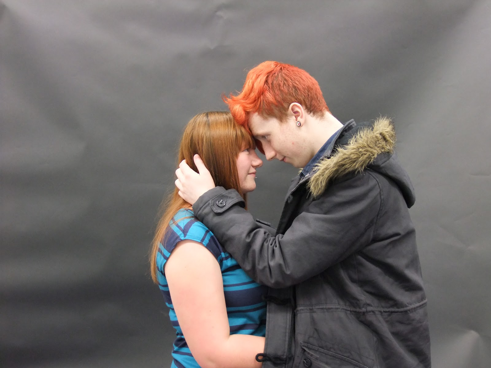
I had chosen to use the back to back image as it is a typical pose of the romantic comedy that is used in many professional texts as seen in my textual analysis research, but I then from my audience research had chose to change this a bit and adapt it to my own style so I had the couple awkwardly holding hands and looking at each other over the shoulder. I chose this mainly because it is the pose I concentrated on most so it came out as the best quality, and I just think it was perfect to show the distance 'two worlds' and the 'collision' of the two holding hands. However, when it came to the close up of the two kissing for the magazine cover this was chose mainly because it looked as if it was continuing down the line and it had also shown the genre more clearly than that of the poster. The close up was to make it more personal and to show that they can be related to by the audience and these are my reasons for chosing these.
Photoshoot Editing
I had chosen not to edit any of my pictures because I feel it would make it look a lot more natural and less perfect. I didn't think that there were edits needed because the pictures were already of a good quality and they fit well on the page and had the effects in which I had wanted them to have. The reasons in which I didn't want to edit the images were also shown in the contact sheet conclusions and looking at my products I do not regret these decisions. I wanted my products to be different to that of any other romantic comedy so I had decided to just have natural so that people could relate to them more, and feel as though they were normal people as well instead of made up actors. The only edits in which I had made was removing the background from the image themselves because this is the idea I had in mind all along.
Photoshoot Images
Even though I was quite far behind, this weekend I had went out and with the help of my friend Katie I have got the images in which I am going to use for my print products. All of the images in which were taken were by me but I had decided to get Katie's opinions on what images to use. From this I am then going to make some conclusions and then say why I had chose these images in particular.


Sound Update
I have decided instead of using Paige singing covers of both Kelly Clarkson and The Wanted I am going to use covers off YouTube. However, in order to do this I have to request the permission of those in which are singing the tracks, and I will do this before converting the videos. I have found the two covers in which I want to use and have requested the permission from the users themselves. Below shows a screen shot of the conversations:
Lightning by Tom Richards:
 I forgive you by Micki Consiglio:


From then on the screen shots are pretty straight forward, once you have confirmed that it is the right clip that you wanted to convert it then goes into asking whether you want to save the MP3 still. This basically shows the link on how to save the MP3 to where you want it to go. This is the end of the simple process and I now have the saved MP3's to put in my trailer.
Lightning by Tom Richards:


The top messages on both of these screen shots show the message in which I had sent them, with their responses underneath. These both show that both of the covers are going to be used as I have gained full permission for them, however I do tend to edit them so that they both fit in my trailer and I think this will be easy as they are both of similar speeds and genres.
From this I had then went on to convert the YouTube videos into MP3's using the website Video2mp3.net. I have taken Screen Shots of the process of converting and then downloading these mp3's to use in my trailer.

Firstly, I had to find the two covers in which I was planning on using for my media products and instead of using three I chose to stick to only two that fit well with the genre. The above screen shot shows me entering the addresses of the videos in which will be found from YouTube and the MP3 clip will then be retracted from the video giving me just the sound. This is what I had needed to do first in order to convert it and put it on my trailer.


These two screen shots show the first step of downloading once the video has been fully converted to MP3. It shows on the left the person who's cover I am going to be using in this case it is Tom Richards's cover of Lightning by The Wanted, and Micki Consiglio's cover of I forgive you by Kelly Clarkson. This is used in order to show you what video you are choosing to convert, and to confirm the idea that it is the right clip before the download.

From then on the screen shots are pretty straight forward, once you have confirmed that it is the right clip that you wanted to convert it then goes into asking whether you want to save the MP3 still. This basically shows the link on how to save the MP3 to where you want it to go. This is the end of the simple process and I now have the saved MP3's to put in my trailer.
Video Update
I created this video in order to discuss how far I have got with the process in terms of filming, editing and capturing. I have then gone onto discuss what I need to do in order to get completed by the deadline. However, I am getting feedback along the way of process so this helps save time and shows clear organisation amongst the cast with help from the actors and what they think about how to make their characters more realistic. I have been told that they should play themselves in order to play the part right and this is why I had decided to just use the music from Paige, and not actually show her singing within the film as it is outside of her comfort zone, and I think this was the best decision and it has made my products more realistic and genre orientated.
On set images

This shows two of the extras in my trailer putting up a white screen in which is used for the white background on my print products.


Subscribe to:
Comments (Atom)