Thursday, 29 September 2011
Sound Conclusion
All of the music I was going to put into my trailer was originally all going to be sang by Paige Harker to make it fully original and creative but I feel it would be difficult for her to sing some of the songs in which I have chosen as they are band songs. However, I have got permission off two people of YouTube to use their songs as covers so I can use these in my trailer and still makes it original, but seems less creative so I am a bit disappointed that I can't use Paige to sing these. I chose all of them because they fit the genre and I feel that they would all fit well together, as they are of different speeds and beats but these show different factors of the trailer.
I forgive you was chose for it's upbeat tempo and this fits in with many of the professional texts I have researched and the lyrics seemed to fit with the genre I was trying to replicate. I forgive can be interpreted in many ways but I think the meaning behind the song is showing the pain and past experience which could explain how my female character is feeling. I think that it is well suited to the genre because it is the typical view of females when it comes to love. I thought it connotes that they were hurt by someone in the past but they have come to forgive them, and I wanted to replicate this in my trailer to show the reason why the characters are so distant, yet still in love. However I looked at the wanted warzone too because it has the same meaning behind it as that of I forgive you but from the males point of view which shows his pain too.
Up was chosen for it's smooth and slow tempo as it fits within a few of the professional texts I have looked at and the lyrics to seem to fit this to an extent. It is a song which is sang by both a male and female, with the lyrics showing it is about them and how they can make it work. I thought this could show some of my narrative once again because it is showing that when everything falls through things can only get better, and they can overcome their issues. This is the main problem in my trailer because they need to overcome their past and also their differences within popularity and morals and they need to pull together and work it out before it is too late, and in the end this is what will happen. So I am planning on using this at the beginning of the trailer.
Worlds apart was chosen just for it's lyrics because it had shown the main issue in which is in my narrative and it is about how different two people are, and they shouldn't work but they do. I think that the meaning within this song is shown clearly and this is why I had chosen this song. However, I think that this will be a hard song to find a cover for or replicate successfully so instead of using this song I am going to use the wanted - lightening and this is because of the lyrics once again. The lyrics are talking about falling in love and also the feelings which could show the romance factor of the genre rather than just the narrative.
Wednesday, 28 September 2011
Sound Update - Trailer Soundtracks
I have narrowed down my choice of soundtrack to the following:
I thought this would be a good song for my trailer because the title is 'When two worlds collide' and this song is explaining how two different people fall in love and shouldn't work but it does, so I think this defines my plot very well.
Kelly Clarkson - I forgive you:
I thought that this may be well suited to my genre because of the lyrics and due to the reason that it is quite upbeat and this resembles previous trailers and professional texts I have previously looked at. I think that in a way this song does show some of the pain in which will be within my narrative and this will later be explained in the sound conclusion. I think that because it is a new song it would not be well known yet, and this is one of the reasons in which I chose this as I want it to seem more original and I think it would fit well within my trailer in the middle. I think this will be the main sound track but it will not be exactly like the original song as I think it would then be too similar and I wanted all of the trailer to be quite original.
James Morrison ft Jessie J - Up
I think that this is well suited to the genre because it is quite a soft song and the meaning is there and it would be fitted to my characters and the narrative as well. It is quite similar to professional texts I have looked at, like the trailer for 'A walk to remember' and I then thought I could use this at the beginning of the trailer as it is introducing the two characters falling in love. I think this song would show the plot well as the lyrics are showing how things can only get better and how it is never to late, and this factor is what I want to represent within my trailer.
Twenty Twenty - Worlds Apart
I thought this would be a good song for my trailer because the title is 'When two worlds collide' and this song is explaining how two different people fall in love and shouldn't work but it does, so I think this defines my plot very well.
I will further discuss these decisions within my sound conclusion in terms of where I will get these songs to put into my trailer and I will then go into detail onto which songs I have chosen, because often romantic comedies only use two songs within the two minute trailer as the story is moving on, so I will have to choose just two.
Sound Ideas
In my trailer I will be using all of the following: dialogue, voiceover, soundtrack and sound effects. I am planning on using all of these because this is what are used in professional Romantic Comedy trailers and I feel this will add realism to my products. I will be using these so that it clearly shows my genre, but I will not use so many sound effects. There are not often many sound effects used in the romantic comedy genre, and this is one of the main reasons in which I had chose this because I am less restricted and it would be easier to replicate something of this genre. I am going to use a voice over, but it will not run continually throughout my trailer and I am planning on using a strong female voice. I am planning on using a female voice because most of the trailers in which I have looked at have used this type of voice over because I think it is more of a dominant voice in which people are inclined to listen to because it would be more powerful than that of a quiet female. I have further discussed my dialogue in the 'storyboard' post and I have discussed my soundtracks in a separate post so that it is not to crammed. However, I know that I want the dialogue I use to be effective in terms of representing the genre and I want it to be well fitted and slightly dramatic. To do this I will try get the characters to use different tones of voice, to show the emotion clearly. In terms of a voice over I am planning on using one in which is similar to the trailer below:
I think that in terms of the voiceover it will be an important factor because most of the romantic comedies I have looked at use these, but it could be the character talking and telling the story as it happens but I don't think this would have the same effect. The sound is an equally important part of a trailer alongside the camera angles / cinematography, and mise-en-scene as it provides an atmosphere. With this the genre would be recognised from the soundtrack, as well as the narrative of the voice over.
Tuesday, 27 September 2011
Weekly Update - Trailer Soundtrack Thoughts
I had put on facebook ideas for my possible soundtracks in order to get people to comment on them, yet the findings weren't as successful as I first thought. I think that the sounds and music within a trailer represents different moods in which are attached to these and I want to show a mixture of emotions, as most romantic comedies do. So I am planning on matching the music to the moods in which my characters are portraying on screen and to do this I will further discuss possibilities for the soundtrack. Furthermore in terms of sound effects, there are free websites in which I can get these from if I decide to do so. I have looked at professional texts to see which music they stereotypically use and it shows they use a mixture of upbeat yet slow songs, so I am going to do this yet use songs in which I feel will replicate my genre, as well as show the narrative clearly. I had researched romantic songs on both YouTube and Google to see what stereotypical people expect and see what had came up. I had found a few in which I thought could be easily replicated and what would be well suited to my genre. I had found the following videos:
I had liked all of the songs above and I feel a mixture of these can shows the turning point of emotions and situations throughout the trailer, and these also could replicate that of a realistic manner because of the lyrics mainly and the mixture of soft, then upbeat music. I haven't yet decided what Songs I am going to use but I feel any of the songs in which I choose will be well suited to both my narrative and the genre but some may be harder to replicate than the others. I think that the top song (You and Me) would be easier for my artist to replicate but it may show too much of the romance within the genre rather than anything else but I feel it is well suited to the genre because of the slow tempo and the meaningful lyrics. In terms of The bottom trailer 'All I want' I think even though this shows the upbeat side of the genre it may be harder for my artist to replicate and I couldn't see it fitting well with the genre in which I have chosen like the others to, as it shows a different side to the romantic comedy genre but it does show the action so it is possible to mix this in but I will have to do a practice of performing this song. The other three songs 'someone', 'you and i tonight' and 'iris' are all well suited to the genre but I don't know if it is relevant to my narrative but I know that my artist could perform this so I may possibly use this but I will discuss this in the later section for the trailer soundtrack.
You and Me:
Someone:
You and I tonight:
Iris:
All I want:
I had liked all of the songs above and I feel a mixture of these can shows the turning point of emotions and situations throughout the trailer, and these also could replicate that of a realistic manner because of the lyrics mainly and the mixture of soft, then upbeat music. I haven't yet decided what Songs I am going to use but I feel any of the songs in which I choose will be well suited to both my narrative and the genre but some may be harder to replicate than the others. I think that the top song (You and Me) would be easier for my artist to replicate but it may show too much of the romance within the genre rather than anything else but I feel it is well suited to the genre because of the slow tempo and the meaningful lyrics. In terms of The bottom trailer 'All I want' I think even though this shows the upbeat side of the genre it may be harder for my artist to replicate and I couldn't see it fitting well with the genre in which I have chosen like the others to, as it shows a different side to the romantic comedy genre but it does show the action so it is possible to mix this in but I will have to do a practice of performing this song. The other three songs 'someone', 'you and i tonight' and 'iris' are all well suited to the genre but I don't know if it is relevant to my narrative but I know that my artist could perform this so I may possibly use this but I will discuss this in the later section for the trailer soundtrack.
Monday, 26 September 2011
Sound Ideas - Singer
I had previously uploaded onto YouTube of my friend Paige Harker singing Between the Trees - White Lines and Red Lights. I think that it is well suited to my genre and it is original but I will get her to re-sing this because it is from a while ago. I am not sure if this is the song I am going to use in my trailer but I have asked her whether she is okay with me using her as the main female in my trailer due to the fact that my character is going to be a singer, and she has agreed. However, if I get her to re-sing this I want to possibly use the guitar because it is going to be one of my props as I feel it makes music more about the musician and guitar is many people's passion. I had posted this video on facebook to get comments and people had agreed that she could be professional as she can also play instruments and I think people could link to her because she has a lot of passion in music. From the beginning of the project I knew I had wanted to use my friend Paige as my trailer song because I feel that it will have more effect and be more original. I feel that her voice fits the Romantic Comedy genre as it is quite a soft voice with edge and I feel this could further represent the events of the trailer because it could be soft as the characters are falling in love, and become edgy to show the complications. I also chose Paige because I have learnt a lot from her as a person and I feel she fits the personality of the character in which I am trying to portray and she is easier to work with. I also feel by looking at other trailers of the similar genre that Paige would fit the scene because she can play guitar, drums and keyboard, so I was planning on using this to my advantage by replicating once again a mixture of 'A lot like love', 'raise your voice' and 'another cinderella story' where it opens with quiet music and dialogue which continues slightly throughout the trailer, going into her singing, then her playing music with the narrative speaking over this and then going back to her singing when her name is said so that it is almost a cycle. However, when she is playing her instruments I will not fully show all of this because then there would not be much left to put parts of my 'movie' in.
This is another video in which I had created of Paige doing Hinder - Lips of an Angel. I think this could be suited to my genre but it is more than likely that I will not use this as a soundtrack in the trailer. I think that I will not use this as a soundtrack because it is not the type of song in which would be represented in this genre, but the message of the song is suited to the genre Romantic Comedy but it was just a sample of my singers voice. I feel that most of my trailer will be music in which I have either created on GarageBand or of my friend playing instruments in which replicates a professional trailer with a smooth, yet often upbeat sample. I am planning on replicating this by using Paige because she sounds like she could be quite professional with a soft voice in which will replicate something similar to that of 'A walk to remember' as this doesn't use a lot of upbeat music due to the story line. However, in contrast I am planning on using upbeat music to show a bit more drama and action.
Looking at both 'another cinderella story' and 'coyote ugly' there is quite a lot of upbeat music to show the action, so I am planning on asking Paige whether she can play the drums also for parts of my trailer. However, by looking at another cinderella story I realised that loud music like this is not appropriate for my trailer because it does not represent the story in which it does in that of the professional trailer. Furthermore, I am going to use upbeat music like in the trailer below:
I have looked at professional texts in order to see what type of music they use but I am planning on replicating this but using less known songs in which fit with the narrative and seems like the singer has actually wrote this because it is meant to be original but I don't have the time to come up with meeting my friend and writing our own songs because that is a lengthy process. I have looked at the following songs in which could be fitted to my genre, as well as my narrative. I have looked at many songs in which could be suited and I have looked at the movie 'What a girl wants' :
From looking at this I had researched the artist because I feel his voice fits the genre and I had found the song 'the distance' and I feel that this fits my genre because it showing the distance and difference between two people and what they want. I think this would be good in my trailer but I am not going to use just one song. I have also found a song in which isn't well known also and it is by 'Twenty Twenty' called worlds apart and I am planning on possibly using this and getting Paige to replicate this but I think it could be slightly difficult unless there is more people singing as it is a band song, so I am planning on asking my other friends such as Shannon who can also sing, and get them to also play the music as well so it is fully original. The song below is the song by 'Twenty Twenty' :
I have many songs in which could be suited and I am going to narrow them down in a following post. The following songs are the ideas in which I have got:
Oliver James:
-The Distance
Kelly Clarkson:
-Save You
Twenty Twenty:
-Worlds Apart
You Me at Six:
-Fireworks
-Knew it was you
-Jealous minds think alike
Hey Monday:
-Candles
-Arizona
-Fall into me
-How you love me now
-Run don't walk
-Set off
-Turn the clock
-Wish you were here
Pink:
-Heartbreaker
-It's all your fault
-Long way to happy
-Love song
-Nobody knows
-Runaway
-Stop falling
-What do you want from me?
Taylor Swift:
-Breathe
-Crazier
-Forever and Always
-Jump then Fall
-Last Kiss
-Love Story
-Mine
-Never grow up
-Our Song
-Speak Now
-Tell me why
Adele:
-Turning Tables
-Someone Like You
Others:
-Broken (Seether)
-Best of You & Walk (Foo Fighters)
-Let your walls fall down (Boyzone)
-I need you (Tim McGraw and Faith)
-The Only Hope For Me Is You (MCR)
-Better in Time & I got you & Happy (Leona Lewis)
-A Year Without Rain (Selena Gomez)
-Apologise & Lost then Found (One Republic)
- You and Me (Lifehouse)
-Freak the Freak out (Victoria Justice)
-Yeah Right (Dionne Bromfield)
-l.i.f.e.g.o.e.s.o.n (Noah and the Whale)
-Fix you (Coldplay)
-Long Distance (Bruno Mars)
I have chosen all of these songs because they show feelings in which could be related to the plot and narrative of my products and I want this to be replicated. Also I chose these because they were less known and I want my trailer to be fully original and want this to be recognised yet it would interest people into finding out more. I have a vague idea of which songs I am going to use and which one's I will not use. I am not sure yet whether I am going to get the music played or use and instrumental to sing to but I would prefer it to be all made by me and my friend, with her playing the music herself. Also I feel all of the songs in which I have picked are professional in terms of genre because if you look at the two clips below it shows upbeat music in which I will replicate:
Friday, 23 September 2011


Thursday, 22 September 2011


22/9/11 Update
Looking at professional texts I have thought about possible captions in which I will use in order to gain effect and add suspense within the trailer to interest people. The trailers in which I have looked at include:
The other trailers in which I have looked at don't often use captions within the trailer, except from giving the names of the actors. From the research however I have realised they often use captions in which are explaining the narrative rather than anything else, so I am planning on using some of the following captions:
-Would you give up your dreams.. For the dream man..
-How much would you do for the one you love
-Take a risk, Take a chance, Take the time, Make a Choice..
-What if the one you lose, becomes your main inspiration...
-What if your inspiration, inspires you to love..
-A faithful heart makes dreams come true..
-Is all fair in love and war?
-This kind of certainty comes once in a lifetime..
27 Dresses:
According to Greta:
Beastly:
The other trailers in which I have looked at don't often use captions within the trailer, except from giving the names of the actors. From the research however I have realised they often use captions in which are explaining the narrative rather than anything else, so I am planning on using some of the following captions:
-Would you give up your dreams.. For the dream man..
-How much would you do for the one you love
-Take a risk, Take a chance, Take the time, Make a Choice..
-What if the one you lose, becomes your main inspiration...
-What if your inspiration, inspires you to love..
-A faithful heart makes dreams come true..
-Is all fair in love and war?
-This kind of certainty comes once in a lifetime..


Flat Plans - Magazine

This is the flat plan in which I have created to replicate that of a professional magazine. I decided to call my magazine 'Reel Film' because it is a pun on words standing for 'real films' and I chose to do this because it has a double meaning, one being that the movies happen in real like (romance) and the other being reel as in a film reel. I had decided to do it like this after I had carried out my textual analyse, where I had looked at the mechanics of a professional magazine and that was when I had found the 'Entertainment' Magazine that was advertising breaking dawn and general entertainment in terms of gossip. This is where I had got my main inspiration from in terms of image and colour, I then decided that I wanted to use the colours in which I have chose. I would like to stick to a three colour palette on my magazine to make it look more professional and not too busy upon the page. I think that in a way the colours in which I have chose make it look like I have aimed the magazine at mainly females as I have used pale colours, but this is not the case. I had chose the pale colours because I thought that it shows a calming atmosphere and because I thought they had fit well with the genre. Furthermore, I have chosen a mixture of warm and cool colours include yellow, orange and blue and the reason behind this is that blue is often associated with boys whereas yellow is more of a female colour, showing that the magazine will be aimed at both genders but the image does clearly connotate the genre of the film it is advertising. I have used a range of techniques on my magazine in order to make it look more realistic and professional without making it overpowering. I had used pale blue as the background to make everything stand up off the page and also to show the calming nature that is around the two characters, with the use of darker colours for the costumes just to exaggerate the image and the characters more, and the reason I did this was due to the opinions I have gathered from feedback on my flatplans. I think that to improve the colours I could use colours in which don't correspond well together to show some of the contrast between the two characters and the narrative in which is behind my story. The image will be quite simple with the two characters close together looking like they are about to kiss eachother, and this is the reason I had used some of the colour red to show the possible danger and the passion between the two characters. I am aiming to do a close up of the two characters centrally positioned because I feel it would be more effective as both characters will be in the eyeline, represented equally to each other and does not give an impression on the characters and whom is the main importance; to some extent it leaves some mystery to it but it would be enough to draw the readers attention.I am planning on using these features continuously throughout my products to show continuity and also to keep similar font on each of my products so it clearly represents the same package. The reason I had chose yellow and orange is due to the fact that they are both quite bright colours which could signify the light-heartness of the two characters and also to show the situation as being happy, but this is not the case and I thought this would therefore signify more change by the contrast of the caption underneath being 'would you challenge fate for the one you love' this therefore shows the danger within the film itself and that not everything is always as it seems, and this was my aim. The reason behind this is because I had found from my audience research that people had preferred some mystery and also some drama or action behind the story itself so it is not all about the romance, and this therefore would also attract males. I think I chose to base my magazine on entertainment because it was less crowded and could appeal to any gender of any age range but I feel I may need to change this in order to reach my target audience which is mainly females between the ages of 16-25 but I wanted to use features in which would attract both genders, not just narrow it to just females. I chose not to do a location shot for my magazine because I thought it would give away too much and also it would draw attention away from the image on the page, which should be the main important feature. I chose not to focus too much on the costume on the magazine because it is introducing the movie and the two characters and I didn't see this as a huge factor, but I did want it to express some of the characters personalities through the clothing that the reader can actually see. I wanted to show the light coming from behind the two characters to show the outline and emphasise the characters by doing this, the way in which I am planning on doing this is by using the gradient tool on photoshop and I have gathered opinions on the matter and it is proven to be a popular idea. Each font in which I am going to use is going to be bold so that it stand out off the pale blue background with only the masthead and 'exclusive' banner being in capitals to emphasise this. I am planning on having the masthead black with the inner masthead being red, and the sell lines and above banner being a mixture of yellow and orange, for the reasons in which I have stated before. I felt that these colours would apply to both genders and also connote the idea of warmth, love and also the calming atmosphere. I want all of the fonts to be quite plain so that they are not part of the stereotypical 'curly' font in which is often used in romantic comedies and I chose to use a plain text so it is easy to read and I am going to further discuss the fonts I am going to use and why in a later post.
Wednesday, 21 September 2011
Typical Romantic Comedy Poses
I have created a slide share in which shows what I have found to be the typical poses in which are often used in romantic comedies. There seems to be seven poses in which are used quite often and these are:
- The back to back pose
- The three floating faces pose
- The park bench
- The giant heads
- The collage
- The pick me up pose
- The lean
I have found that a variation of romantic comedies often use these poses and I will explain the further effect in which each of these have and also show some images as an example of each pose. The website in which I had found all of these poses was the website and the different pages show the different poses and I think I will find this useful when doing my flat-plans and producing my products. The link for the website was on the empire website: http://www.empireonline.com/features/romantic-comedy-movie-poster-cliches/p1
The back to back pose: This pose shows the two main characters standing back to back and this often occurs in romantic comedies in particular. I have found that this technique or pose has been used for a long time, and in the same way throughout these years. I think that this pose is used in order to show the natural side of things but also it could connote the attitude between the characters depending on what the characters are actually doing for examples of this pose I have taken a older example as well as modern examples. The three examples I will analyse are 'Pretty Woman', 'Life or something like it' and 'Ugly Truth'.

The three floating faces pose: Often used in romantic comedies has been used for a long period time and for many different reasons, I have taken three into consideration to compare and these included 'Bridget Jones: The Edge of Reason', 'You, Me and Dupree' and 'License to Wed' and looking at these they are all used in many different ways.

Each of these posters show the three floating faces pose, and I think it connotes the interference in the movie in each of the three I have looked at. For example in Bridget Jones the center character has to decide between the two male characters on the screen, where on the other two the middle character is getting in the way. I think that this could be suited to my genre but I am not planning on using this for my poster or magazine, because there is less of an interference and I want it to show more romance and comedy, rather than drama.
Another pose in which I have looked at is the park bench pose which is where the two main characters are sat next to each other; often used in romantic comedies. The three in which I have looked at other than 'It's a boy girl thing' are the following movies 'Laws of Attraction', 'Knocked Up' and 'Ghost Town'.

This pose shows the two main characters sat next to each other and this could be suited to my genre as a typical pose. The poses often show the faces of the characters to clearly show what kind of plot there is going to be, and what situations the characters will get into. The bench pose adds the sense of location and sets the atmosphere of the film to the audience.
The next pose in which I have looked at is the giant heads pose which is the pose in which shows the main characters as a close up showing just their faces. I have compared all of the three 'Something to talk about', 'what women want' and 'just friends' and these are from all different time eras and are similar in the ways in which they use the pose.

This pose shows the two main characters as large heads and clearly shows the relationship between the two characters and gives a hint at what may occur in the movie. I am planning on using this type of pose for my magazine so that it clearly shows the relationship and shows the typical part of the narrative and not the rest. I thought this was the most romantic pose of the seven and this is why I would choose to promote this way on the magazine.
The fifth pose was the collage pose, where a lot of the images from the trailer are taken and put together to look like a collage of pictures, and this is often used on photograph boards etc. The three movies in which I had compared were 'Love Actually', 'He's just not that into you' and 'Valentine's Day'.

I think this type of pose is very effective as it shows a lot of the characters within the movie, and shots from the movie and it gives a wider view into the film and narrative, introducing characters in a way. This pose is a way in which introduces all the characters and shows all of the popular actors in which are in the film and this would interest a wider amount of people. Therefore, I am not planning on doing this because I don't feel it would have the same effect as the professional text.
The sixth pose was the pick me up pose and it is often where the male character is lifting up the female character and clearly shows the romance factor so this is the main reason it is used in this genre often. I have looked at 'While you were sleeping', 'Just Married' and 'A Cinderella Story'.
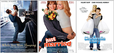
This pose is clearly aimed at the romantic comedy genre in particular because it shows the two main characters close and shows the romance between the two. All of the posters in which I have gathered show the men lifting up the females and clearly connotes how the romance is meant to be, and this pose is often used. I think that the first poster is most effective because of the set location, it sets the full atmosphere showing feelings and I think it could be effective so I was considering this for my poster, or a shot in my trailer at least.
The last pose in which is used quite a lot in romantic comedies is the lean pose where one of the main characters is leant on the other main character. I have compared 'Forces of Nature', 'Failure to Launch' and 'Remember Me'.

- The back to back pose
- The three floating faces pose
- The park bench
- The giant heads
- The collage
- The pick me up pose
- The lean
I have found that a variation of romantic comedies often use these poses and I will explain the further effect in which each of these have and also show some images as an example of each pose. The website in which I had found all of these poses was the website and the different pages show the different poses and I think I will find this useful when doing my flat-plans and producing my products. The link for the website was on the empire website: http://www.empireonline.com/features/romantic-comedy-movie-poster-cliches/p1
The back to back pose: This pose shows the two main characters standing back to back and this often occurs in romantic comedies in particular. I have found that this technique or pose has been used for a long time, and in the same way throughout these years. I think that this pose is used in order to show the natural side of things but also it could connote the attitude between the characters depending on what the characters are actually doing for examples of this pose I have taken a older example as well as modern examples. The three examples I will analyse are 'Pretty Woman', 'Life or something like it' and 'Ugly Truth'.

These are three similar poses but connote different things. Pretty Woman is the oldest of these three posters and it represents the comical side of the film as it shows the woman holding onto the mans tie over her shoulder and it shows the woman in control. The back to back pose shows the two completely different people one in which is rich and the other in which is a prostitute and it shows the cheeky side and it represents anything is possible in love. The second poster is similar to show the woman is more powerful and it doesn't clearly replicate the genre so I am not using this as an influence. The ugly truth was my main influence as it shows the typical back to back pose in a way leaning against a wall, well a black line. It clearly stands off the background because it is red off a plain white background which is effective. Furthermore, the hearts clear show the genre it is replicating but I feel it is a good pose but would be better against an actual wall or toilets that show male or female sign.

Each of these posters show the three floating faces pose, and I think it connotes the interference in the movie in each of the three I have looked at. For example in Bridget Jones the center character has to decide between the two male characters on the screen, where on the other two the middle character is getting in the way. I think that this could be suited to my genre but I am not planning on using this for my poster or magazine, because there is less of an interference and I want it to show more romance and comedy, rather than drama.
Another pose in which I have looked at is the park bench pose which is where the two main characters are sat next to each other; often used in romantic comedies. The three in which I have looked at other than 'It's a boy girl thing' are the following movies 'Laws of Attraction', 'Knocked Up' and 'Ghost Town'.

This pose shows the two main characters sat next to each other and this could be suited to my genre as a typical pose. The poses often show the faces of the characters to clearly show what kind of plot there is going to be, and what situations the characters will get into. The bench pose adds the sense of location and sets the atmosphere of the film to the audience.
The next pose in which I have looked at is the giant heads pose which is the pose in which shows the main characters as a close up showing just their faces. I have compared all of the three 'Something to talk about', 'what women want' and 'just friends' and these are from all different time eras and are similar in the ways in which they use the pose.

This pose shows the two main characters as large heads and clearly shows the relationship between the two characters and gives a hint at what may occur in the movie. I am planning on using this type of pose for my magazine so that it clearly shows the relationship and shows the typical part of the narrative and not the rest. I thought this was the most romantic pose of the seven and this is why I would choose to promote this way on the magazine.
The fifth pose was the collage pose, where a lot of the images from the trailer are taken and put together to look like a collage of pictures, and this is often used on photograph boards etc. The three movies in which I had compared were 'Love Actually', 'He's just not that into you' and 'Valentine's Day'.

The sixth pose was the pick me up pose and it is often where the male character is lifting up the female character and clearly shows the romance factor so this is the main reason it is used in this genre often. I have looked at 'While you were sleeping', 'Just Married' and 'A Cinderella Story'.

This pose is clearly aimed at the romantic comedy genre in particular because it shows the two main characters close and shows the romance between the two. All of the posters in which I have gathered show the men lifting up the females and clearly connotes how the romance is meant to be, and this pose is often used. I think that the first poster is most effective because of the set location, it sets the full atmosphere showing feelings and I think it could be effective so I was considering this for my poster, or a shot in my trailer at least.
The last pose in which is used quite a lot in romantic comedies is the lean pose where one of the main characters is leant on the other main character. I have compared 'Forces of Nature', 'Failure to Launch' and 'Remember Me'.

This pose isn't as seen as often but often the lean shows the characters falling for each other like in poster one but it could also represent the relationship like in number three. I don't think that this is as effective as the others so I am not planning on using these because I don't think, unless they're like number three, they are realistic in terms of the genre.
In Conclusion, I think that in terms of a romantic comedy all of the above poses are useful and can be used to clearly connotate the genre in which I am trying to replicate. However, I am planning on using the 'back-to-back pose' and also the 'giant head' pose for my poster and magazine. I am planning on using these because I thought they would be easier to replicate realistically and also if I was to create a mixture of products in terms of print I would use a mixture of all of the poses to make it more effective in terms of the romantic genre. I think that by using the poses I have chosen clearly shows the romance factor and the back-to-back I am planning on using I could make it more lively to attract a wider audience, and the giant heads could be livened up by the facial expressions and the things in which are surrounding the actors of the film I am creating. In terms of the other poses however I think they could have been more appropriate and fixed to my genre, especially in my opinion the pick me up pose, because it shows the romance between to characters; but hopefully my analysis of all of the poses connote why I had chosen the poses I had in order to fit my narrative and characters. I have used a narrative where the two characters are worlds apart so I though that the back-to-back pose would be the most relevant for this and doesn't give a lot away, but the giant heads can give a little more of the narrative away, showing they fall in love.
Friday, 16 September 2011
Flat Plans - Poster
This was the first draft of the poster in which I am going to create for my film but I feel it could be more effective. I have done the poster like this so it resembles the poster for 'the ugly truth' and it shows the two separate worlds and how the two characters are distant. However, I am planning on changing this so that it is more fitted to the genre and also so that it shows more of the 'romance' factor as well as the distance between the two characters. I am intending on changing this so that the male character is facing the wall with the woman in the same position but looking back.

I stuck to three main colour palette once again for the poster and this consisted up of; black, pink and blue, this is because it shows the boy and girl theme with black being a neutral colour in between and also the sophisication and mystery within the story. I had chose to emphasise the characters clothing on this, with them showing the contrast between the two characters which was suggested by my focus group. The image will be like that of the 'ugly truth' poster and it will be quite simple with the two models facing away from each other, with the stereotypical looking over the shoulder pose. I am going to do this by having the female facing away and the two characters holding hands and the male looking over his shoulder at her. I am planning on doing that to show the difference between the two characters and also connote some of the feelings and personality of the two characters, with both of them being equal but very different people. I wanted my poster to look different to that of most of the texts I have looked at just because of the fact I want it to also show the comedy side of it all. The poster will be a long shot so that audience can see the full character and also their eyeline will be in the center third to suggest they are equal to each other, with them also creating their own view of what they think may happen in the film being advertised. I have tried to make my flatplans based on the feedback I had gotten from my focus group in order to do this to their standards so it appeals to a wider audience.
Once again I am going to use bold texts on my poster so that it is clear to read and will catch the eye of the audience from far away, with it standing out off the white background. I am planning on having most of the text in capitals to emphasise what the text is saying; and by this I have decided the characters names and the titles will be in capitals, with the tagline being in smaller fonts. I am planning on making the credits in capitals small but on the bottom of the page to make it look more professional like in the texts I have looked at. The title has put the emphasis on 'two worlds' showing the contrast once again between the two characters showing that they are from two totally different background and may not fit well and work well together. However in terms of this I am going to have the last name of the male in blue, with the female in pink and also then going on to use black for the title and red for the release date and website. The reason in which I did this was to show continuity between the two print products and I am planning on running this through to my trailer as well to show the package as a whole.
I chose to use a simple layout so that it is easy to look at and follow with the use of tagline showing what the narrative is about without given away too much of the storyline. I did this to create something that will draw in the reader and add mystery and grab interest of the readers, whether they are male or female. I tried to attract the right audience for a Rom Com bu showing the factors on my print products but I am planning to push through the comedy sector more in the trailer and this was a question for my focus group, and the decision was suggested by the majority of the people asked.
I have also included the certificate to show that it is suitable for any age but also the date its released and a website, to just provide somevmore information as this is always included on a movie poster, as the poster is an information element as well as for promotion.
I have also included the certificate to show that it is suitable for any age but also the date its released and a website, to just provide somevmore information as this is always included on a movie poster, as the poster is an information element as well as for promotion.
16/9/11 Update
I feel that I am a bit behind in terms of the work in which I have to do. This is because I have focused mainly on my flat plans and this means that I haven't yet completely completed my storyboards which are one of the main parts of the production process. This means that I am going to focus more on my storyboards for the rest of the week outside of lessons so that I have caught up with the rest of the class. Furthermore, I have thought in detail about possible sound and dialogue and I have found a few trailers in which I am going to base my trailer around, as I have already thought in detail about my magazine and poster.
The following clips are my inspiration for my trailers:
The following clips are my inspiration for my trailers:
I have taken inspiration from this trailer as the way it is set out because it has a similar storyline. I have taken the inspiration for the female character from this trailer as well as from 'a walk to remember' to show the emotion and vulnerability of the female character, and some of the personal traits are similar for example both female characters in the trailers I have looked at show they are trying to improve themselves but in different ways. However, in the other trailers 'coyote ugly', 'it's a boy girl thing' and 'another cinderella story' all of the female characters seems to have a vulnerable yet edgy side and this is how I want my female character to be. However, the male is always confident in all of the trailers I have looked and I will take this trait but edit it so it is not similar to all other romantic comedies. My male character in my rom com is going to be quiet yet confident, in a lower class who eventually finds the words to say to the main female character. In the beginning he is going to be shy and it's all glances but then it suddenly changes when they meet at a gig where she is singing, but they realise they aren't that different and fall in love. Furthermore, there will be complications like in raise your voice where she is told she has to go back to the area she came from, but it ends in a happy ending.
AND
I have taken this clip as inspiration due to the different characters in which are in the trailer, and also I plan on taking the dialogue and captions as inspiration as well so that it is more professional. I am going to also include the 'songs featured from..' at the end because my friend is planning on singing for the trailer so I will have to clearly state that it is her music. I firstly took inspiration from the fact that she was terminally ill as a complication but I have changed this to match raise your voice complication because I think it would be easier to realistically replicate and also I don't feel that the emotion of my actors would be as real. Furthermore, I am using similar captions which I will discuss in a further development of ideas.
Flat Plans- Magazine Inspiration
I have used these three magazines as inspiration for many different reasons. I am going to use some of the forms and conventions of each of these magazines in order to create my product (magazine) to have some realism to a real product. When I had put these on my questionnaire each of the magazines had been commented on by different people and what had attracted the audience to that specific magazine. I will discuss my findings and how I had taken inspiration from these.

30 % of the people in which I had questioned had said that they preferred this magazine cover due to the use of contrasting colours and a big image in which stands out when on display in a shop. Another person had said that the picture in which is the main image shows mystery behind the character and I think this is because the character is in the eye-line of the reader which could connote that they are equal as people. I am planning on taking inspiration from this by using contrasting colours and a large main image, but I feel that the use of this sort of image would not be suited to my genre so I am planning on taking this and using the two main characters as a large image to clearly represent the genre I am doing but in terms of the titles I will use a large text and the colours in which are similar to that of the 'Empire' magazine.

15 % of the people I had questioned had said that the magazine in which appealed more to them was 'total film' because it looks like there would be more action due to the three characters and it looks like it could be a love triangle that could represent more drama and suspense. Also other comments were that it clearly could represent my genre but needs to use brighter colours but the people questioned had liked the captions on this magazine because it shows some action. From this I have found that people aren't just looking for a romantic comedy but products which show the drama and suspense of the events also. From this I have taking this into consideration and I am planning on using a caption in which is like this saying 'would you take the risk?' and I am going to add more colour but the image I am not going to use because I have already shown the drama within that of my poster, where the two characters are seen separate and therefore replicating the title 'when two worlds collide' and shows that the two worlds that are meant to class meet in a whole new light, slightly like a modern Romeo and Juliet with a comical edge.

35 % of the people I had questioned had preferred the 'Entertainment Weekly' even though this is not actual a film magazine I will base my product around this largely. I am going to use a shot like this as the main image because it clearly replicates the genre I am doing and I feel it is most effective in terms of this. However, one person commented that it shows the love story instead of the drama in which they seem to prefer. I am going to use this as my full inspiration but change in so that it is not too similar. Furthermore, I am changing the colours so that they stand out more off the page and make it more eye catching to the reader.

In conclusion, I had asked the audience about another magazine and 20% had commented on this but the information given was not important to me in order to inspire the way I am going to make my magazine. However, one comment was that the colours and the captions but once again this layout wouldn't be fully replicating my genre as it is not an official magazine. Another comment was just about the film appealing more to them as they like fantasy films so I did not find this helpful therefore I am not using this as an inspiration of my magazine. I am using 'Empire', 'Total Film' and 'Entertainment Weekly' as inspiration but I have taken the main layout of 'Entertainment weekly' in terms of image, yet taken similar colours from 'Empire' and dramatic captions from 'Total Film' and combined these to appeal to a wider potential audience of both genres.
Flat Plans Inspiration (Poster)
I have gathered two images in which I could use as inspiration for my products as it has two main characters in which my film also will. However, during looking at posters for the romantic comedy genre these are the two in which stood out most to me because of the positioning of the two characters being quite far apart, or in different worlds and this is what I want to connote in my products. Furthermore, I have thought about props in which my characters will also have on the poster and this will be further shown and explained when creating my flat plans.

I have taken inspiration from the ugly truth by using a similar image because it shows the drama and difficulties of all typical relationships and I think this would appeal to a wider potential audience. 55% of the people in which I had questioned said that this poster appealed more to them because it shows two very different people that are obviously going to fall in love which gives the impression that anything can happen. Also because I had questioned people of different ages it shows that this is suited to a wider age range because adults had commented that it is more suited to their age and a film they prefer, whereas a younger audience had commented on the mystery and also people had said that it was more realistic because of the use of clothes and the image standing out to them, it appears that the characters are just like every other person. However, in terms of the overall poster the comments in which were made was that it was not too busy but it needs more colours. In terms of this comment I am going to use this image as inspiration yet change the colours so that it stands out to a wider audience with characters in which the potential audience can relate to.
AND

I have taken inspiration from 'It's a boy girl thing' by using a similar pose, and a similar male character. On my poster I am going to use similar clothing as the male character so that he looks quite lower class, casual with the female looking of a slightly higher social class, but still casual. I wanted to do this to create a slight complication between the two characters when they fall in love and the narrative will further explain this. 20% of the people I had questioned had said that it has eye-catching colours, poses and a good image in which shows everyday people. From this I have interpreted that a poster using these sorts of people and colours attract both males and females and shows more of a comical side so from this I am intending on taking the character inspiration and personality from the movie, with the male being lower class typical and outgoing, and the female being lower class trying to better herself when they learn they aren't so different. I feel using pink will connote women, and blue to connote men as the two stereotypical colours for the genders.
However I had also gave two other magazines in which I wanted comments on because I also found these inspirational in the beginning but it appears that they didn't appeal to the audience in the way in which I assumed. I had asked the audience what they thought of the posters 'A Cinderella Story' and 'Bride Wars'. From this I had found that 15% had been attracted by 'A Cinderella Story' whereas only 10% was interested by 'Bride Wars'. The two posters are shown below:

The comments in which were made about the poster for 'A Cinderella Story' was that it could connote different worlds coming together and falling in love, anything can happen. Also another comment was that it shows a happy couple with less text which makes it more appealing to them as a person. I have in a way taken this as inspiration because my magazine I am planning on making has less text because I had taken this into consideration, but I have twisted this and have shown the drama rather than the love story in the poster but I am planning on changing this by making them have a wall between them but they man with his hands against the wall facing the woman to show the love between the two characters but showing the woman just singing and not realising him, or pretending not to at least, which is shown in my narrative.

There was only one comment in which was made on this poster and this was that this was preferred by a female of 17 years of age and this is because it shows the controversy between the two girls in which could show them fighting over the main character and in a way I could of used this but I didn't want to give this much of the narrative away.
In conclusion, I have chosen 'The Ugly Truth' as my MAIN inspiration mainly due to the fact it shows the distance between the two characters but it shows they will fall in love due to the use of props. However, I am going to change this to the male character with his hands against the wall looking to the girl, with the girl turned away slightly but looking at her, to show the potential romance between the two characters without giving too much away.
Sunday, 11 September 2011
11/9/11 Update
I have gathered two clips of films in which I have taken my main inspiration of as I feel that it is a mixture of both. I have taken the idea from 'Another Cinderella Story' of a lower class character who is trying to live her dream, but this is how the inspiration of 'Coyote Ugly' appears.
Violet Sanford (Piper Perabo) leaves her hometown of South Amboy, New Jersey, her father Bill (John Goodman), and best friend Gloria (Melanie Lynskey) to pursue her dreams in nearby New York City. When leaving town to become a songwriter, she signs an autograph, which is pinned on the wall of the pizza place where she worked. The wall has many other autographs signed by the rest of the employees in South Amboy that left town hoping to make it big.
In 'another cinderella story' the main male character is of a well off background as he is a singer, with the complication of his ex-girlfriend trying to ruin their chances of being together. However, the main female is a lower class worker, with the typical cinderella plot; two step-sisters and an evil stepmother. She has a dream of becoming a dancer and this is one aspect I will use in my products, but with singing rather than dancing.
I have researched the plot of the movie Another Cinderella Story and this is what I have discovered:
This movie is a retelling of the Cinderella fairy tale in a modern setting, with Mary Santiago (Selena Gomez), a high school student with ambitions of becoming a dancer, taking the role of Cinderella; Tami (Jessica Parker Kennedy) Mary's only best friend as her fairy godmother; Dominique Blatt (Jane Lynch) taking the role of the stepmother; Britt (Emily Perkins) and Bree (Katharine Isabelle) as the two stepsisters; and Joey Parker, (Drew Seeley), now a famous celebrity that has returned to school for his senior year and to remember why he started dancing, as the prince. A school dance substitutes for the ball, with the role of the glass slipper filled by a Zune (music player).
In conclusion, I have taken aspects of both films and from this have further discussed how I will connote this through my narrative. I have got a clear idea for my poster & magazine and will further discuss these when making my flat plans. However, I do not have a specific idea of the characters yet, but have got a female character in which I am going to be using.
I have researched the plot of 'Coyote Ugly' and have discovered that the main plot-line is:
Violet tries unsuccessfully, dozens of times, to get her demo tape noticed by the recording studios. With only a few dollars left in her pocket after her apartment is robbed, she goes to an all-night diner and notices some girls flaunting the hundreds of dollars in tips they earned. After inquiring, she finds out that they work at a trendy bar named Coyote Ugly. She finds her way to the bar and convinces the bar owner Lil (Maria Bello) to hire her. Lil hires her and explains she did so because Violet looks like a kindergarten teacher who the childish bar patrons will come to see. She is reluctantly nicknamed "Jersey". After starting her job, she quickly discovers she must learn the ropes of singing, dancing, and performing wild acts before a rowdy crowd.
One night, she tries to get herself noticed by a music industry scout. The bartender jokingly points out Kevin O'Donnell (Adam Garcia), making her believe that he is the bar owner. When the joke is discovered, Violet feels that Kevin was making a fool out of her. This event eventually brings them closer together. Kevin tries to help her in overcoming her shyness on the stage and they finally become lovers, in spite of his attempt to hide his past and departure from Australia. One night when she's doing a rowdy move while having water poured on her, Violet's dad Bill decides to pay her a visit at work and gets angry at her. Then Bill gets in a massive car accident.
She finally lands a deal with a record label after a successful performance at an open mic night at the Bowery Ballroom, which was attended, by all of the 'Coyotes' from the Coyote Ugly saloon.
In 'another cinderella story' the main male character is of a well off background as he is a singer, with the complication of his ex-girlfriend trying to ruin their chances of being together. However, the main female is a lower class worker, with the typical cinderella plot; two step-sisters and an evil stepmother. She has a dream of becoming a dancer and this is one aspect I will use in my products, but with singing rather than dancing.
I have researched the plot of the movie Another Cinderella Story and this is what I have discovered:
This movie is a retelling of the Cinderella fairy tale in a modern setting, with Mary Santiago (Selena Gomez), a high school student with ambitions of becoming a dancer, taking the role of Cinderella; Tami (Jessica Parker Kennedy) Mary's only best friend as her fairy godmother; Dominique Blatt (Jane Lynch) taking the role of the stepmother; Britt (Emily Perkins) and Bree (Katharine Isabelle) as the two stepsisters; and Joey Parker, (Drew Seeley), now a famous celebrity that has returned to school for his senior year and to remember why he started dancing, as the prince. A school dance substitutes for the ball, with the role of the glass slipper filled by a Zune (music player).
In conclusion, I have taken aspects of both films and from this have further discussed how I will connote this through my narrative. I have got a clear idea for my poster & magazine and will further discuss these when making my flat plans. However, I do not have a specific idea of the characters yet, but have got a female character in which I am going to be using.
Subscribe to:
Comments (Atom)